Both my shots included Tara and Michael, the two main characters, it is meant to fill up messing scenes and also base the theory on black and white relationships- inter0race relationship is a common factor. Its is still stigmatised but the labelling has decreased drastically during my research i came across interesting studies in regards to inter-race relationships.
To read the article click here
I learnt from the article, that it is more popular to see black men and white women couples than any other inter-race relationship, the reason behind it differs,
My two shots:
The gun was my main focus however, i wanted a shot where the girl and the guy was engaging the same activity of trying to shoot or focusing the gun on something, for my this shot showed a connection between the two characters. The consumers can interpret the image as the guy manipulating the girl. this shot challenged existing media products because of the orientation of the page; it was landscape not portrait.
This shot is a portrait page orientation, like most posters that have been produced; it is a standard A4 size. The image captivates a clear shot the the gun and replicates a similar position as my magazine. Michael stands behind Tara as 'devils advocate' however i felt this was more strongly depicted in picture 1.Tara is not looking away from the camera but towards it. However both characters express different emotions- i did this to challenge existing media products and also to arose curiosity amongst my target audience, to wonder and ponder on what the storyline might be like.
After my analysis of my shot i then progressed to show them to my target audience, i went round asking people on their opinion and giving them a brief about the project and what genre i was focusing on.
The results were as this, 16 people opted for the first picture and 13 for picture 1, i felt that this result was close and concluded that if i had asked more people there might be a change in results. However i decided to use the results that i had gathered. Some respondents left comments about my shots:
After gathering my results and concluding i then progressed to designing my Poster, using the software Photoshop Adobe I started to construct how my magazine should be like. I started by choosing a desirables background. I didn't want to follow the same trend as my magazine because i realised that institutions do this i.e Empire but i wanted to do something different wanted to provide my audience with different scenes and background and not the same ones.
I took two photos of a brick wall because it connotes with urbanity, the bleak appearance and shabby looks can also resemble poverty, most of my characters are hit by this which causes their behaviour to be deviant because they lack material goods. using a slightly dark corner displays the darkness behind the door and works well with my project title.
The font looked appealing however it didn't fit the urban style that i was trying to achieve.
Simple font, however it resembles the common masthead used for magazines.
simple but lacks character.
Looked more like a cowboy theme or a army theme but not one that dramatises my Behind Closed Door
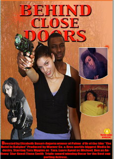
My first draft of my magazine looked like this:

This was my first draft on the poster, there were many faults and the feedbacks i received criticised me for not looking at my research in depth, if not at all. I wanted my poster to have several images so that my audience can be captivated by it but it didn't really work well. he poster did not follow conventions.
There was no positivity that i received from my poster and i was advised to start from scratch.


No comments:
Post a Comment