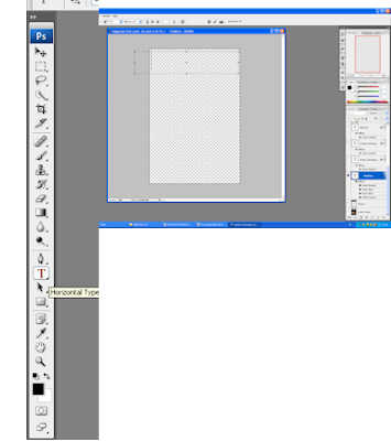
This is how to write text on Photoshop using the toolbar on left, I selected the Horizontal Type and created a box. The box created would automatically provide me a new layer.
The font is 93 Pt, this takes up about 10% of my magazine page, as planned before.
Masthead is an essential for magazines; during my research I found that masthead makes the audience aware of what magazine they are reading. Through the masthead it is clear to see if the magazine is directed at girls or boys, women or men. It distinguishes if its genre, i.e. film magazine, lifestyle magazine, music magazine. i conducted a survey asking at random 20 people their opinion on what would be the appropriate font for my magazine.
 |
Figure 12 Font: Arial black |
 |
Figure 13: Font: stencil |
 |
Figure 14: Algerian |
 |
Figure 15: Font: Impact |
(insert tally and graph)
Placing background setting onto the Magazine front cover
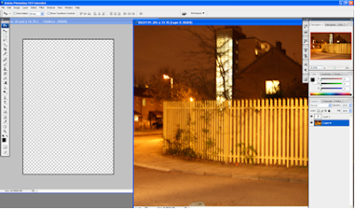
 To move an image onto a new document, you left click on the image, making sure that you are on the correct layer then drag it to the document that you wish the image to be placed. This would automatically create a layer on the new document.
 My background was perfect in terms of the theories that surrounded it, making the location of the film known, however I felt that it needed to be edited. The original colour (amber) did not give the image a certain appeal- it looked like a cowboy theme as opposed to crime. I wanted a more darker and intense feel to the background image at the same following a theme of crime and lust. I used the software
Editing the colors of the background
The level adjustor (displayed on the left) allows me to eliminate the primary colors (Red, Yellow and Blue) or (R, Y, B). Adjusting the level of colors creates different colors that could suit my genre.
The exposure tool allows me to dramatize the image. I can stratify all the lighting from the image or over-expose it to light. To create my urban look I withdrew a lot of lighting to create a more surreal and youth- urban feel. Below, the image has been edited using the exposure tool. The sense of urban lifestyle is beginning to appear.
The brightness/Contrast instrument, allows me to manipulate the level of brightness that is emitted from the image. It deals with the lighting and shading aspect of editing. I intended to make my image dark to represent the darker life that the characters are experiencing. Also it fits with my theme of dark aspects to show the dark figures of crime that circulates society.
Below is the edited image using the tool 'Brightness/ Contrast' it is noticeable that the contrast is low along with the brightness to create a more darker appearance.
(cover line screen shots for magazine)
Review for Magazine
One of my friend suggested that I change the color of the masthead background to Black so the Title could stand out more. He explained that the brown background did not make the magazine masthead stand out, but using black would bring out the title making it more eye-catching. Below, is the two different masthead, that I created.
Understanding Bar codes

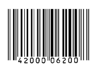
During my research i found that magazines use bar codes on the front cover of the magazines. Bar codes is a white-background with black stripes device machine readable data container. It allows distributors to scan, read and retrieve information about the product, however the relexability is limited for consumers because they could only retrieve these information through the distributor or seller using a bar code reader. Barcodes are essential for magazine, during my research i found how it is consistently used, it tracks the magazines, it reads the magazines information and informs the reader about the magazine. Barcodes, were first developed by Bernard Silver, he constructed bar codes for rail ids and then it became commercialized for supermarkets. Barcodes are not only used for labeling foods, tins but are very versatile.
Website accessed: http://www.en.wikipedia.org/wiki/Barcode
Enter the 21st century, and we have upgraded the traditional Bar-code usage and image. The QR (quick response) code is a modern and upgraded version of the traditional bar codes as shown in the image (upper left). Mainly used in Korean and a popular feature on smartphones such as, Blackberry, iphones etc... the QR code has taken a leap into the 21st century.
QR code is a white blank background which is covered in black blocks, the formation of the QR codes are different and unique and are more accessible for consumers. majority of my target audience hold smart phones, which act as scanners- for instance, Blackberry can scan products which have the Qr codes. The featuring of QR codes on products are not featured on magazines, i found during my research. Reasons for this, i do not know however i find that placing QR codes on magazines is a good marketing strategy. i decided to use it on my magazines as a way of heightening competition with my rivals, challenge existing products by broadening my horizon and setting up a whole new genre of technology. The reason i used QR code, it because my target audience would be fascinated by the use of a new bar code and it would promote them to use the QR system.

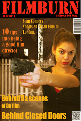
This is my final version, the feedback from my audience prompted me to rectify any mistakes.
Changing the masthead background to black makes my masthead stand-out. I re-positioned my cover line to the top section of my magazine page, in this position it is more clear to see, the color contrast against the dark background.
The main cover line position was changed to a more visible and neater position as opposed to before, this is so my consumer can identify the main cover line more easily and its stands out more, as opposed to the red background. Although i changed some of the colors i still stuck to my color scheme which was 'red' and 'black' however the oranges and yellow enabled my users to read information. I didn't want too much dark colors and sought to give off a more professional and urban-like image, as researched institutions ensure that their cover lines are visible.


Elizabeth, please post/publish your EVALUATION!
ReplyDelete- Dokun