Evaluation
The video box below, is my an audio file, i am discussing how the three of my projects link together and explaining about the media technologies used and audience feedback.
Using, the adobe premier for my video suite was a big transition from the basic software of photo abode. Premier had the elements of what existing media products would use for their teaser trailer. abode premier equipped me with the essential technology that would be needed for my trailer. The timeline enabled me to place and edit my clips, and the program enabled me to view the clips i had edited. This is parallel to what institution, such as, Warner Bros. would use in their production, although it would be of a high level than mine. As explained before in my audio, i created representation through editing my clips, the production stage. i am able to convey messages through the arrangements of clips and through other elements such as audio, effects etc... i.e when the the girl is running away the soundtrack increases to dramatize the action and also build up an atmosphere amongst my audience. The arrangements of title graphics has been placed after each significant action, i.e the shot of a the wounded gun/ "crime?", the title graphic "crime" was adjacent to transmit messages to my audience about the genre and give them a tease about the plot of the story.
in my production stage i bore in mind the enigma theory, the theory of teaser trailers being a mystery amongst their audience, it is intended to build up clues, and the only way the audience can solve the puzzle is by watching the film- we notice this theory being used in various of teaser trailers, i.e Black Swan. My target audience is manifested to be engaged and drawn to my trailer because of all the mystery of trying to solve the story plot, and the enigma theory is fulfilled through the production stage of editing the trailer.
My magazine cover, which was ancillary task 1, was intended to reach my target audience as well as a technique of promoting my film. Institutions follow this convention as a way of reaching out to different spectrums of their audience, i didn't want to challenge this convention because it is required to get a mass of people watching your film. I used the software; Adobe Photoshop, as it is easier to edit pictures and place text in.
Pages
Creating 'Behind Closed Door'
Welcome,
Step right into my blog, and read about my exciting and multi-media research into how I created my Teaser Trailer
Step right into my blog, and read about my exciting and multi-media research into how I created my Teaser Trailer
Monday, 28 March 2011
Monday, 7 February 2011
Constructing my poster
I started my magazine from scratch, i was introduced to a new software Adobe Indesign. I read about how the software worked and then progressed to using it to construct my magazine.
 Adobe Indesign is a software that enables users to create text, it specialises in constructing articles and covers things that involve mass uses of text. it does have little counter parts on editing pictures. I realised that photoshop was not fully equipped to edit text like indesign.
information on Adobe Indesign Cs5.
 Adobe Indesign is a software that enables users to create text, it specialises in constructing articles and covers things that involve mass uses of text. it does have little counter parts on editing pictures. I realised that photoshop was not fully equipped to edit text like indesign.
 Creating a credit block
Credit blocks are usually situated at the bottom of posters, it explains who is in the film, the producers and directors of the film- it credits those who participated in the major roles of the film. Credit blocks makes consumer aware of the film, credit blocks, also promotes those who construct the film- including 'big' names ensures that the consumers are aware of the stars that are in the film.
My first attempt into forming a credit block was a fail!
Very straight-lined and unappealing this showed lack of research of the conventions that credit block followed. My teacher then advised me to start this again using the right software.
I received better reviews for my credit block, it now looked like a professional credit block because it followed the convention. Credit blocks show style and variety it complements the poster.
How to create a logo
Logo is essential for posters, logos shows promotes producers and also makes the audience aware, logos also makes the product look professional and reliable it gives it a signature look like a painting. I found that every poster i came across at least one logo was used, it can also prevent copyright and credits other institutions sponsor. using the software Photostop, because it deals more with creating images.
Producing a logo was relatively simple, logos authenticate work, and I didn't want to plagiarise by deriving my logo from the internet i wanted every image and text on my work to be of my own.
Indesign use
The margin helps with precision, it ensure that my content does not go out of line. In my research i noticed how posters are carefully aligned with each other, there is an invisible line that is left bare from any text or images but only the background crosses it.
example 1
example 2
example 3
after adjusting my margin in progressed to placing my components fir my magazine.
example 1
example 2
example 3
after adjusting my margin in progressed to placing my components fir my magazine.
Monday, 31 January 2011
Starting my Poster
I shot shots that intended to use for this ancillary, i wanted to follow the same trend as my magazine but make it different in appearance. i then produced a survey for my audience so that they can select which shot is most appropriate for my poster. Engaging my audience makes them interact with my production, it enables me to have an insight into how they feel about existing products.
Both my shots included Tara and Michael, the two main characters, it is meant to fill up messing scenes and also base the theory on black and white relationships- inter0race relationship is a common factor. Its is still stigmatised but the labelling has decreased drastically during my research i came across interesting studies in regards to inter-race relationships.
To read the article click here
I learnt from the article, that it is more popular to see black men and white women couples than any other inter-race relationship, the reason behind it differs,
My two shots:
The gun was my main focus however, i wanted a shot where the girl and the guy was engaging the same activity of trying to shoot or focusing the gun on something, for my this shot showed a connection between the two characters. The consumers can interpret the image as the guy manipulating the girl. this shot challenged existing media products because of the orientation of the page; it was landscape not portrait.
This shot is a portrait page orientation, like most posters that have been produced; it is a standard A4 size. The image captivates a clear shot the the gun and replicates a similar position as my magazine. Michael stands behind Tara as 'devils advocate' however i felt this was more strongly depicted in picture 1.Tara is not looking away from the camera but towards it. However both characters express different emotions- i did this to challenge existing media products and also to arose curiosity amongst my target audience, to wonder and ponder on what the storyline might be like.
After my analysis of my shot i then progressed to show them to my target audience, i went round asking people on their opinion and giving them a brief about the project and what genre i was focusing on.
After gathering my results and concluding i then progressed to designing my Poster, using the software Photoshop Adobe I started to construct how my magazine should be like. I started by choosing a desirables background. I didn't want to follow the same trend as my magazine because i realised that institutions do this i.e Empire but i wanted to do something different wanted to provide my audience with different scenes and background and not the same ones.
I took two photos of a brick wall because it connotes with urbanity, the bleak appearance and shabby looks can also resemble poverty, most of my characters are hit by this which causes their behaviour to be deviant because they lack material goods. using a slightly dark corner displays the darkness behind the door and works well with my project title.
My first draft of my magazine looked like this:
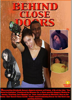
This was my first draft on the poster, there were many faults and the feedbacks i received criticised me for not looking at my research in depth, if not at all. I wanted my poster to have several images so that my audience can be captivated by it but it didn't really work well. he poster did not follow conventions.
There was no positivity that i received from my poster and i was advised to start from scratch.
Both my shots included Tara and Michael, the two main characters, it is meant to fill up messing scenes and also base the theory on black and white relationships- inter0race relationship is a common factor. Its is still stigmatised but the labelling has decreased drastically during my research i came across interesting studies in regards to inter-race relationships.
To read the article click here
I learnt from the article, that it is more popular to see black men and white women couples than any other inter-race relationship, the reason behind it differs,
My two shots:
The gun was my main focus however, i wanted a shot where the girl and the guy was engaging the same activity of trying to shoot or focusing the gun on something, for my this shot showed a connection between the two characters. The consumers can interpret the image as the guy manipulating the girl. this shot challenged existing media products because of the orientation of the page; it was landscape not portrait.
This shot is a portrait page orientation, like most posters that have been produced; it is a standard A4 size. The image captivates a clear shot the the gun and replicates a similar position as my magazine. Michael stands behind Tara as 'devils advocate' however i felt this was more strongly depicted in picture 1.Tara is not looking away from the camera but towards it. However both characters express different emotions- i did this to challenge existing media products and also to arose curiosity amongst my target audience, to wonder and ponder on what the storyline might be like.
After my analysis of my shot i then progressed to show them to my target audience, i went round asking people on their opinion and giving them a brief about the project and what genre i was focusing on.
The results were as this, 16 people opted for the first picture and 13 for picture 1, i felt that this result was close and concluded that if i had asked more people there might be a change in results. However i decided to use the results that i had gathered. Some respondents left comments about my shots:
After gathering my results and concluding i then progressed to designing my Poster, using the software Photoshop Adobe I started to construct how my magazine should be like. I started by choosing a desirables background. I didn't want to follow the same trend as my magazine because i realised that institutions do this i.e Empire but i wanted to do something different wanted to provide my audience with different scenes and background and not the same ones.
I took two photos of a brick wall because it connotes with urbanity, the bleak appearance and shabby looks can also resemble poverty, most of my characters are hit by this which causes their behaviour to be deviant because they lack material goods. using a slightly dark corner displays the darkness behind the door and works well with my project title.
The font looked appealing however it didn't fit the urban style that i was trying to achieve.
Simple font, however it resembles the common masthead used for magazines.
simple but lacks character.
Looked more like a cowboy theme or a army theme but not one that dramatises my Behind Closed Door
My first draft of my magazine looked like this:

This was my first draft on the poster, there were many faults and the feedbacks i received criticised me for not looking at my research in depth, if not at all. I wanted my poster to have several images so that my audience can be captivated by it but it didn't really work well. he poster did not follow conventions.
There was no positivity that i received from my poster and i was advised to start from scratch.
Monday, 24 January 2011
Research for Ancillary product: Poster
The reasons behind creating a poster
softwares used to produce such posters
Research and analysis of existing products
how you are going to challenge them?softwares used to produce such posters
My second ancillary task is a film poster; a poster is a piece of printed-paper, which is attached to a wall or vertical surface. A poster usually advertises a product or informs the public about upcoming or important events.
Orientals: Posters can be portrait or landscape; it depends on what billboards or surface that it is going to be attached to, or the original orientations of the picture (either portrait or landscape). Billboards near the motorway tends to be portrait whilst billboards in the bus stop tends to be portrait, the orientations of posters depend primarily on the original picture.
A film poster is another form as advertising, just like film magazines it aims to appeal to the audience by using creative, conventional and product-related images. A film poster has to have an image, and it has to have the title of the film. It is necessary because the audience needs to know what film is being advertised and also to become familiar with the theme of the film.
During my research I found that if a film produced and distributed a poster and was on the from cover of a magazine, they usually follow a trend. A trend that makes the audience aware of the film, this type of technique implants an image on the consumers’ mind, an image that would trigger their memory once they view product. That is why it is essential for the media text to follow conventions and to create a product that has a visual impact.
Below is an example of a poster thats follows a similar theme to their magazine. Previously shown in my reserach on the magazine, we can see that the picture is the same whilst the fonts and design around the image has changed. It is amusing how the style and fonts enables the consumer to idenitfy what type of media product it is. The poster (on the left) is very simple in design yet effective, the title of the film stands out and the credit block can barely be seen, the colours used connotes the Victorian era and quite simplistic however this poster drew millions of viewers.
A poster, i learnt from this media product does not have to be too compact depending on the genre, the image and layout should draw a crowd in. a poster is a form of advertisement and should resemble that by the colors, layouts, fonts, images and wordings used- it should work well toegther.
I looked at one website which gave me an insight on the 7 ways an effective poster is created.
click here to view the website. The writer explained that the 7 techique is:
1. 1. Attention – jump out from the wall.
In this poster we automatically are caught up by the essence of blue, it is clear that it conotes the supernatural world, because it does not fit with our vibrant and colourful world we live in, it is surreal and distant from us. the unusal use of color springs out towards the target audience to the point that they have a feel on what genre the film is.
The three close-upshots of the character also displays the main characters but also builds up an atmosphere beacause of their facial expression.
2. Iconography – showing without telling
Iconography is showing an icon without actually needing to explain because it is already injected into consumers mind, it has a label attached to it and automatically reads meaning.
The iconographic image is throns around the actors head, the 'Crown of Thorns' a well known symbol to represent our Lord Jesus Christ who died and suffered for our sins, so that we may have life. The Thorns connotes pain and suffering entwined with the huge love that god had for us. The icon is recognised worlwide, so the public can easily identify the image without hesitation.
Using iconographic image makes the audience distinguish the genre and motive of the film, it draws attention and spells a thousands words through one image. Iconography is not used a great deal by instiutions because props usually take thet postion od iconography however props can also be iconic as well.
3. Interest – create an incentive to see the film.
The lightening creates a dramatic tense feel to the poster, use of a urban background (concrete) acts as an incentive for youths to watch the film.The urban life looks dramatised and dark which is an incentive for some audiences.
The use of characters located in different places, different postions, different levels and facial expression draws a range of target audiences because it is mixed ethinicites, mixed style of dressing and mixed atmosphere being projected by the characters. It is clear that it is targeted at youths/students institutions use interest that appeals to the majority of them.
4. Style- a look that's consistent with film
Credit block 1: uses an orange font, we note how the font style is the same but the size differs some parts have low cases compared to others.
4. Style- a look that's consistent with film
Setting a theme and being consistent with it ensures that the audiences engage with the product (or advert) example of a style it the black swan poster, the theme of using dark colours and elegant make-up is consistent and does not deviate. the theme is kept up and does not side track to other themes. Consistent style ensures the the audience attention is focused on the message and genre that the product is trying to transmit.
5. Recognizability-
Having a poster that can be easily distinguished is essential, take this old time classic, Indiana Jones, we only have to see the khaki shirt and rope with a tabby hat to know that its the famous Indiana Jones. the image has become almost iconic because it is recognised globally. Indiana Jones have always stuck to their trademark of using yellowy and orangey effects to dramatise their poster.
Credit Block
Below most posters we would identify a credit block, a credit block gives the audience and promotes names or the film. It informs the readers about the main producers, directors, characters of the film as a way of enticing more audience or showing a latest work of a person or institutions. Credit blocks is not a convention because some posters opt not to include it, however I want to include a credit block in my poster because, it gives it a professional effect and not only that but my target audience are able to read about the rewards received by the institutions.
Below are different styles and formats of credit blocks.
 |
| credit block 1 |
Credit block 1: uses an orange font, we note how the font style is the same but the size differs some parts have low cases compared to others.
Monday, 17 January 2011
Constructing my magazine continued
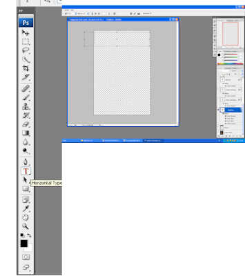
This is how to write text on Photoshop using the toolbar on left, I selected the Horizontal Type and created a box. The box created would automatically provide me a new layer.
The font is 93 Pt, this takes up about 10% of my magazine page, as planned before.
Masthead is an essential for magazines; during my research I found that masthead makes the audience aware of what magazine they are reading. Through the masthead it is clear to see if the magazine is directed at girls or boys, women or men. It distinguishes if its genre, i.e. film magazine, lifestyle magazine, music magazine. i conducted a survey asking at random 20 people their opinion on what would be the appropriate font for my magazine.
 |
Figure 12 Font: Arial black |
 |
Figure 13: Font: stencil |
 |
Figure 14: Algerian |
 |
Figure 15: Font: Impact |
(insert tally and graph)
Placing background setting onto the Magazine front cover
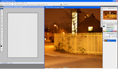 To move an image onto a new document, you left click on the image, making sure that you are on the correct layer then drag it to the document that you wish the image to be placed. This would automatically create a layer on the new document.
 My background was perfect in terms of the theories that surrounded it, making the location of the film known, however I felt that it needed to be edited. The original colour (amber) did not give the image a certain appeal- it looked like a cowboy theme as opposed to crime. I wanted a more darker and intense feel to the background image at the same following a theme of crime and lust. I used the software
Editing the colors of the background
The level adjustor (displayed on the left) allows me to eliminate the primary colors (Red, Yellow and Blue) or (R, Y, B). Adjusting the level of colors creates different colors that could suit my genre.
The exposure tool allows me to dramatize the image. I can stratify all the lighting from the image or over-expose it to light. To create my urban look I withdrew a lot of lighting to create a more surreal and youth- urban feel. Below, the image has been edited using the exposure tool. The sense of urban lifestyle is beginning to appear.
The brightness/Contrast instrument, allows me to manipulate the level of brightness that is emitted from the image. It deals with the lighting and shading aspect of editing. I intended to make my image dark to represent the darker life that the characters are experiencing. Also it fits with my theme of dark aspects to show the dark figures of crime that circulates society.
Below is the edited image using the tool 'Brightness/ Contrast' it is noticeable that the contrast is low along with the brightness to create a more darker appearance.
(cover line screen shots for magazine)
Review for Magazine
One of my friend suggested that I change the color of the masthead background to Black so the Title could stand out more. He explained that the brown background did not make the magazine masthead stand out, but using black would bring out the title making it more eye-catching. Below, is the two different masthead, that I created.
Understanding Bar codes
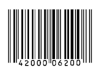
During my research i found that magazines use bar codes on the front cover of the magazines. Bar codes is a white-background with black stripes device machine readable data container. It allows distributors to scan, read and retrieve information about the product, however the relexability is limited for consumers because they could only retrieve these information through the distributor or seller using a bar code reader. Barcodes are essential for magazine, during my research i found how it is consistently used, it tracks the magazines, it reads the magazines information and informs the reader about the magazine. Barcodes, were first developed by Bernard Silver, he constructed bar codes for rail ids and then it became commercialized for supermarkets. Barcodes are not only used for labeling foods, tins but are very versatile.
Website accessed: http://www.en.wikipedia.org/wiki/Barcode
Enter the 21st century, and we have upgraded the traditional Bar-code usage and image. The QR (quick response) code is a modern and upgraded version of the traditional bar codes as shown in the image (upper left). Mainly used in Korean and a popular feature on smartphones such as, Blackberry, iphones etc... the QR code has taken a leap into the 21st century.
QR code is a white blank background which is covered in black blocks, the formation of the QR codes are different and unique and are more accessible for consumers. majority of my target audience hold smart phones, which act as scanners- for instance, Blackberry can scan products which have the Qr codes. The featuring of QR codes on products are not featured on magazines, i found during my research. Reasons for this, i do not know however i find that placing QR codes on magazines is a good marketing strategy. i decided to use it on my magazines as a way of heightening competition with my rivals, challenge existing products by broadening my horizon and setting up a whole new genre of technology. The reason i used QR code, it because my target audience would be fascinated by the use of a new bar code and it would promote them to use the QR system.
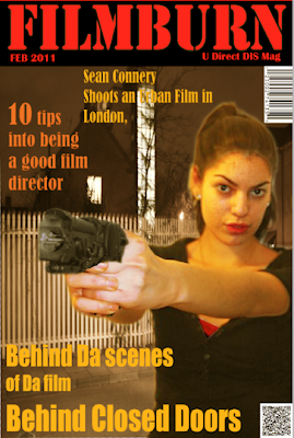
This is my final version, the feedback from my audience prompted me to rectify any mistakes.
Changing the masthead background to black makes my masthead stand-out. I re-positioned my cover line to the top section of my magazine page, in this position it is more clear to see, the color contrast against the dark background.
The main cover line position was changed to a more visible and neater position as opposed to before, this is so my consumer can identify the main cover line more easily and its stands out more, as opposed to the red background. Although i changed some of the colors i still stuck to my color scheme which was 'red' and 'black' however the oranges and yellow enabled my users to read information. I didn't want too much dark colors and sought to give off a more professional and urban-like image, as researched institutions ensure that their cover lines are visible.
Subscribe to:
Comments (Atom)


